No more ugly, broken websites.
Professional Website Design
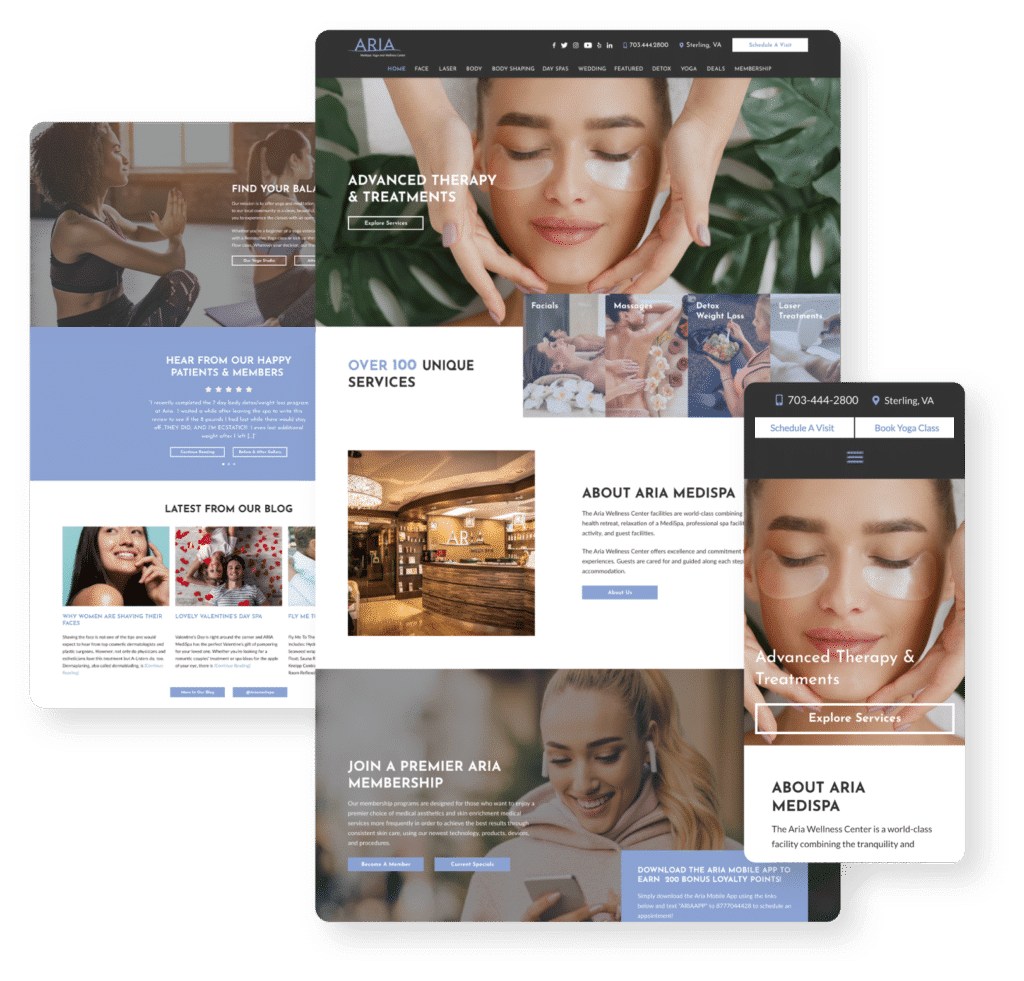
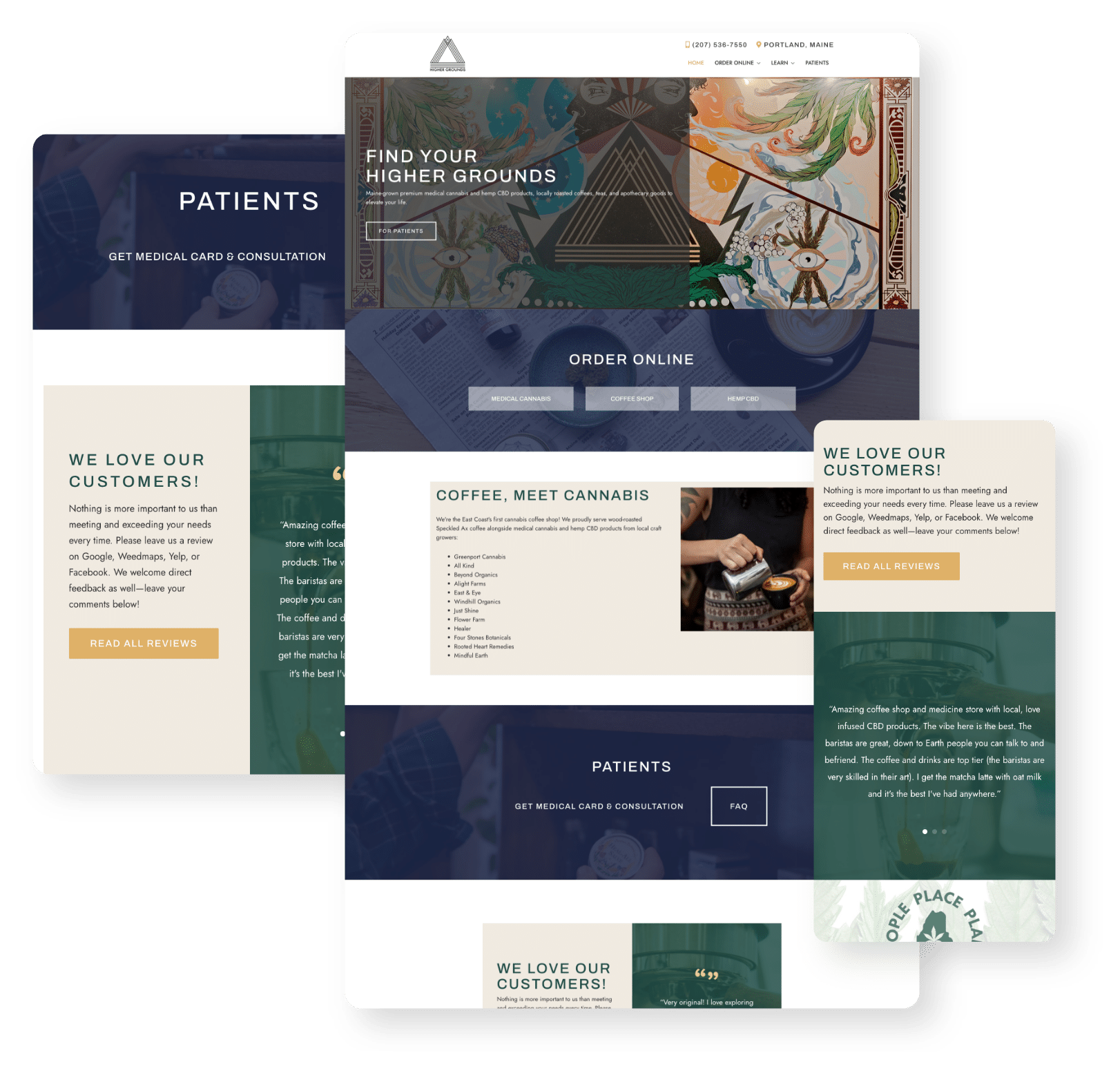
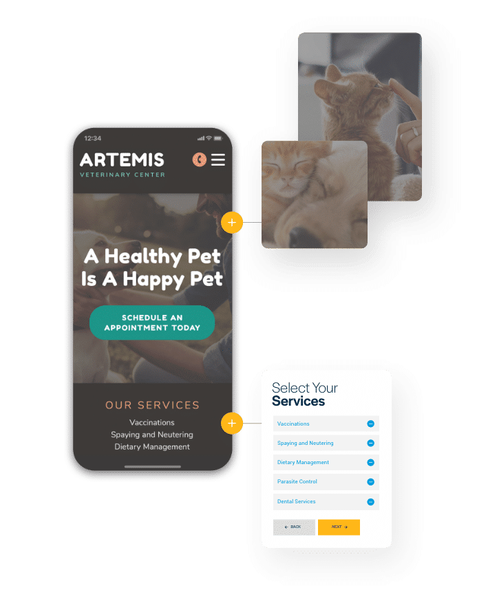
Every MyAdvice website is as functional as it is beautiful. They’re designed to be easy to use, easy to look at, easy to navigate, and easy for search engines to index. We take care of accessibility concerns, functionality issues, hosting, security, and backend architecture so you can focus on your business.


DID YOU KNOW...?
Your website directly impacts your marketing.
When it comes to marketing, all roads lead to your website. It doesn’t matter how much traffic is coming to your website if your website can’t convert visitors into clients. Investing in your website means improving the rest of your marketing too. There’s no one size fits all solution for website design. Here are a few reasons you should consider a MyAdvice website.

Security for you and your clients
Protect your website and your clients from breaches and downtime.
With cybersecurity attacks on the rise, it’s more important than ever to choose a reliable, secure hosting provider. MyAdvice makes sure your website stays secure so your clients' information stays secure, and your website doesn’t go down.

Built to convert
Supercharge your website conversions with specialized designs.
Regardless of which type of website you choose for your business, MyAdvice’s website design team has more than 20 years of experience creating websites that showcase expertise and quality work, and build trust with visitors. You do great work, and there’s a reason people trust you. The same is true for us – it’s time to shine online.


Content that counts
What’s on the page matters too – build trust with excellent content.
Convert more visitors into clients and rank higher in search results with the right copy. Build trust with your potential clients and patients and showcase your work, expertise, and skill sets. Our copy is created for humans, which means your website visitors will want to read it.
Which website is right for you?
Options for every budget and business.
Looking for all of the bells and whistles? Or maybe something more affordable? We have that, and everything in between.

Active Marketing
The Signature+ Website
If you’re looking for an industry-leading website with minimal effort, this is the solution for you. We customize your website to meet your needs and your budget, and then work with you to monitor performance and make updates. All Signature+ websites are completely redesigned and upgraded every two years: meaning your website is always updated, at the forefront of industry standards, and ready to convert visitors to clients.
Who Is It Right For?
Well-established businesses looking to take their websites to the next level
Competitive industries, specialties, or locations
A business that needs a platform that can handle SEO, PPC, or email marketing with more complex strategies like unique content, gated content, and landing pages
Those with no design or marketing experience
Who Isn’t a Good Fit?
Businesses that need simple websites to be used primarily for referral confirmation. If this is what you want, the Signature+ will work, but the Catalyst may be all you need. (Learn about the Catalyst.)
What's Included In a Signature+ Site
Conversion-driven design.
A cutting-edge website tailored to your business needs
A custom, SEO-friendly URL built on WordPress engines
E-commerce features like shopping carts and order processing
Always-on chat, monitored 24/7
Responsive, mobile-first design that meets all industry standards
Fully compliant with ADA accessibility standards as mandated by law
New every two.
A completely redesigned website every 2 years
Refreshed content and updated website architecture
Ongoing Advice.
Robust, up-to-date reporting via the Success Center
Request updates and edits to your website content
Extensive training and how-to provided for additions and maintenance
Reliability and security.
Meets all SSL security standards to protect sensitive information and data
Reliable hosting and nightly backups so you’re always online
Referral Confirmation
The Catalyst Website
Looking for a more basic option that is designed, developed and maintained for you? A Catalyst website might be just the perfect fit. Your practice growth consultant will help you collect all the information you will need on your website, as well as share examples we have built for clients in your industry. Then, your onboarding team will work with you on any final details needed. Finally, the MyAdvice design team will get to work on the build.
Who Is It Right For?
New businesses with very limited budgets
Businesses that need a website fast
Businesses that aren’t doing SEO
Not Recommended For:
Businesses with aggressive growth goals
Competitive industries or locations
More advanced marketing strategies, such as SEO and PPC

What’s Included With a Catalyst Site
Fast and easy.
Content included. Filling your website with industry-specific content has never been easier!
Pre-designed theme library. Choose from a variety of themes that match your branding.
Completely adjustable. You can modify just about anything on the site to fit your brand.
Informative.
Connected to social. Share all your social media links so your visitors can easily engage with your content across the web.
Bio and staff information. Catalyst sites include a dedicated bio page for you to showcase your experience!
Focused on conversions.
Upload documents and allow clients to download with the click of a button
Chat integration available - monitored 24/7
Shine online.
You’ve worked too hard for too long to blend in online. MyAdvice shines a light on the great work you do so others take notice.


