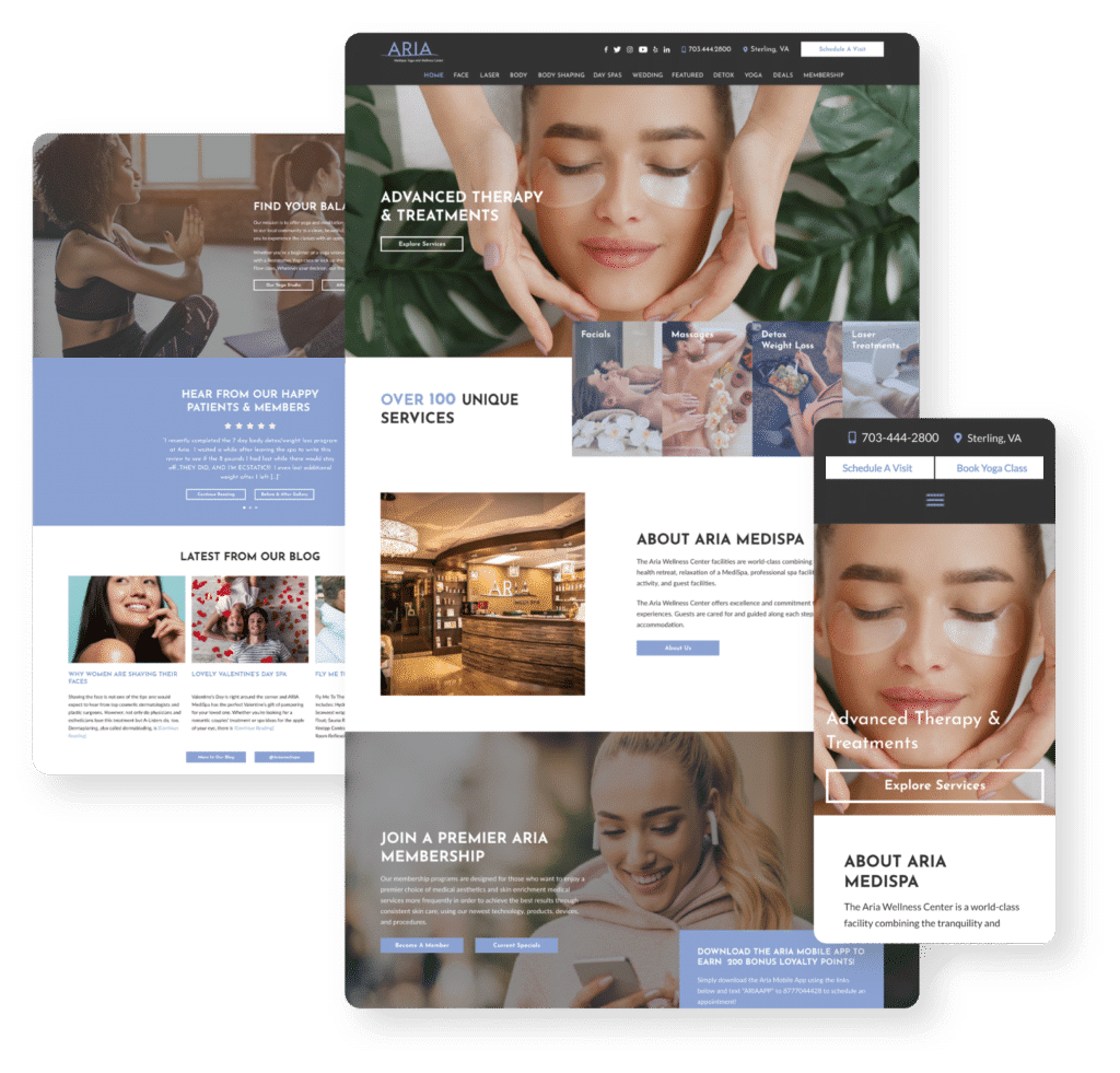
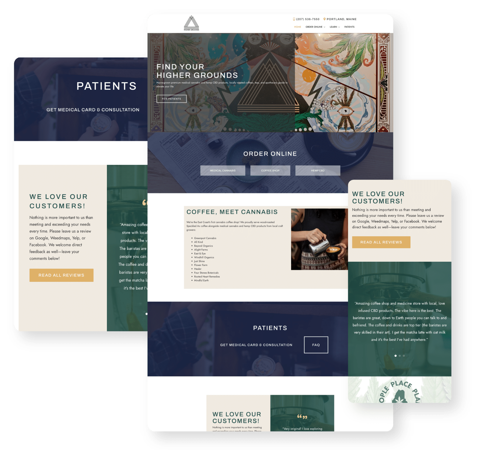
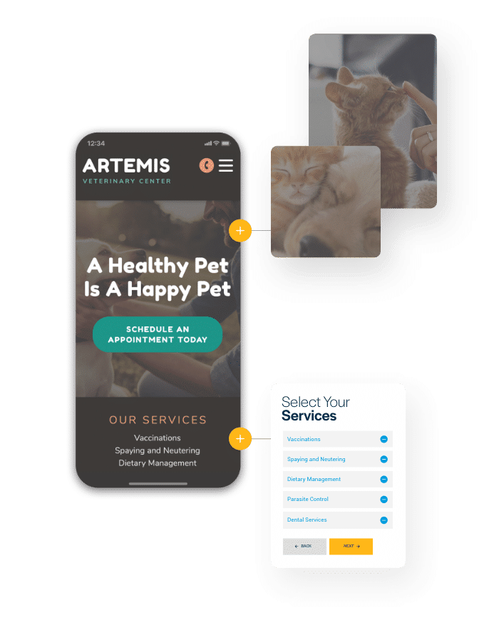
No more patchwork websites.
Success-Centered Websites
Every website built by MyAdvice is more than just attractive — it’s engineered for profitability. Designed to be fast, accessible, conversion-optimized, and AI-powered, our websites serve as the front door of your Success Center. We handle everything from hosting and security to accessibility, content structure, and automation — so your site doesn’t just look good, it gets smarter over time.


DID YOU KNOW...?
Your website is the AI signal that powers your growth.
In today’s digital landscape, your website isn’t just a brochure — it’s your most powerful marketing and conversion tool. It fuels search visibility, guides lead conversion, and signals credibility to both people and AI platforms. That’s why every MyAdvice website is wired into the Success Center — where AI-driven content, automation, and design combine to turn visitors into clients.

Secure by design
Reliability and protection come standard.
All MyAdvice websites are built on a secure, stable foundation. With SSL, ADA compliance, daily backups, and industry-grade hosting, your site stays live, fast, and protected — safeguarding both your reputation and your clients’ data.

Built to convert
Smarter websites = better ROI.
We’ve spent 20+ years designing websites that do more than look good — they drive results. With AI-informed layouts and intelligent CTAs, every site is structured to build trust, showcase your expertise, and maximize conversion automatically.


Content that performs
Copy that converts — for humans and search engines.
Our content is search-optimized and AI-structured to ensure visibility across Google, voice assistants, and modern search platforms. Formatted for readability and performance, it reflects your voice while helping both people and AI understand why your business stands out.
Coming Soon: Content creation, automated.
Mya will soon help keep your website fresh and high-performing by generating new content, improving structure, and optimizing existing pages — all based on your business context and platform data.
Which website fits your success plan?
Options for every business and budget.
Looking for all the bells and whistles for your website? Or maybe something more affordable? Either way, we have options that have you covered!

Active Marketing
The Signature+ Website
Signature+ is more than a website — it’s a profit-optimized front end for your entire Success Center. With stunning design, AI-enhanced integrations, and conversion-focused content, it’s ideal for high-performing businesses ready to grow faster and smarter.
Best for:
Competitive markets or specialties
Multi-channel marketing (PPC, email, automation, etc.)
Clients looking for a future-proof "front door" to the business
Teams with limited time or design resources
What You Get:
A conversion-focused, mobile-optimized, SEO-friendly site
E-commerce, chat, scheduling, and conversion tools
Continuous enhancement of the site infrastructure
Always-on Success Center reporting and support
24/7 monitored AI chat + ADA compliance
Bulletproof hosting and nightly backups
What's included in a Signature+ site?
Conversion-driven design.
A cutting-edge website tailored to your business needs
A custom, SEO-friendly URL built on WordPress engines
E-commerce features like shopping carts and order processing
Always-on chat, monitored 24/7
Responsive, mobile-first design that meets all industry standards
Fully compliant with ADA accessibility standards as mandated by law
Continuous improvement.
Ongoing growth-focused platform enhancements that happen automatically—no request needed
Performance upgrades focused on speed, search optimization, conversion, security, and automation
Coming Soon: Enhanced AI layout intelligence. Mya will soon recommend and apply page layouts automatically based on content type, industry, and performance best practices — making every update faster and smarter.
Ongoing Advice.
Robust, up-to-date reporting via the Success Center
Request updates and edits to your website content
Extensive training and how-to provided for additions and maintenance
Reliability and security.
Meets all SSL security standards to protect sensitive information and data
Reliable hosting and nightly backups so you’re always online
Referral Confirmation
The Catalyst Website
Catalyst is your fast, affordable entry into website design for your Success Center. Built from proven layouts and AI-optimized templates, it includes everything you need to get discovered and start converting — with minimal input and maximum support.
Best for:
New or budget-conscious businesses
Businesses that need a website fast
Businesses that need a strong web presence without complexity
What You Get:
Industry-informed content and design templates
Easy content adjustments and customization
Bio pages, social media links, and performance tracking
Conversion tools like forms, widgets, chat, and downloads
Success Center integration with AI-driven insights and future expansion

What’s included with a Catalyst site?
Fast and easy.
Content included. Filling your website with industry-specific content has never been easier!
Pre-designed theme library. Choose from a variety of themes that match your branding.
Completely adjustable. You can modify just about anything on the site to fit your brand.
Informative.
Connected to social. Share all your social media links so your visitors can easily engage with your content across the web.
Bio and staff information. Catalyst sites include a dedicated bio page for you to showcase your experience!
Focused on conversions.
Upload documents and allow clients to download with the click of a button
Integrate AI-powered chat in your Success Center
YOU ASKED, WE ANSWERED
Frequently Asked Questions
Explore website-related questions growth-minded business owners ask before scaling smarter with MyAdvice.

What can a website do for my business?
Your website is a critical part of the Success Center — engineered for speed, AI-ready, and built to convert.
Websites are non-negotiable because they help businesses establish legitimacy, showcase service offerings, highlight positive testimonials, show up in traditional and AI-powered search, and more. But what drives real growth is how that site connects to the rest of your system: automated follow-ups, reputation tools, lead intelligence, and 24/7 AI engagement. If your site isn’t part of an intelligent system that turns visits into revenue, it’s not just underperforming — it’s holding you back.
Not sure how your site is performing? Find out instantly, and completely free!

Do I really need a new website if I already have one?
Only if you want it to work harder.
It’s not enough to have a pretty website. Yours may fall short in other critical areas, such as speed, search optimization, or conversion. There’s even a risk that your website content is invisible to AI systems. Our platform includes sites that are fast, scalable, and deeply integrated into your lead generation, automation, and reputation strategy.

What makes a good small business website?
It should be optimized for speed, AI-ready, easy to navigate, mobile-friendly, and conversion-focused.
But most importantly, it should be part of an integrated growth system. Because real growth comes when your website is connected to follow-up automation, reputation management, lead tracking, and intelligent chat.

How fast does my website need to be?
Fast enough to keep visitors from leaving.
Our websites are optimized for Core Web Vitals, mobile performance, and AI parsing. Faster load times mean lower bounce rates, better rankings, and more revenue. It’s not cosmetic - it's critical to how your site performs across the search ecosystem.

Can your websites integrate with my existing tools or CRM?
Absolutely — but most clients simplify.
While we can integrate with your current tools, most clients find the Success Center replaces the need for separate CRMs, chatbots, schedulers, or lead trackers. Everything’s in one place — easier, faster, and more connected.

How does a MyAdvice website support search optimization?
It’s not just a site — it’s a signal.
Our websites are structured to support both traditional SEO and AI-powered search — with schema, fast load speeds, semantic formatting, and location clarity. It’s the foundation of your visibility system.
Coming Soon: Smarter setup from day one.
Our new design assistant will soon guide your setup through interactive chat — making it easier than ever to share your preferences and launch a stunning, high-converting site on the first try.
Why does all this matter? Because your website isn’t a separate tool — it’s the AI-powered "front door" to your business that drives your digital growth strategy. With MyAdvice, your site isn’t just part of your brand. It’s part of your system for profitable growth.

