Even firms built on referrals can’t ignore digital anymore. When someone hears your name — from a friend, a colleague, or a referral source — their next step is the same: they search for you online. What they find (or don’t find) determines whether you get the call.
The MyAdvice Success Center helps law firms of every size and specialty build trust, prove authority, and turn online visibility into new client relationships. It’s not just digital marketing — it’s a connected growth system designed to simplify intake, strengthen credibility, and deliver measurable ROI.

The Ultimate Guide to Legal Marketing
Whether you practice family law, personal injury, corporate, estate planning, or another specialty, your clients are looking for credibility and confidence before they ever pick up the phone. A growth system built on trust, visibility, and efficiency makes that possible.
Here’s how the Success Center breaks it down into six growth levers:
Effort Meter
Legal Firm Websites
What makes a good legal website?
FUN FACT
of users' mistrust of a business website is directly related to web design elements.
For most clients, your website is where the decision to contact you is made. They’re asking: Do I trust this firm with my case? Do they have the authority, credibility, and results I need?
The Success Center ensures your website projects authority, clarity, and professionalism. It’s not just a digital business card — it’s your most valuable piece of real estate for winning new clients.
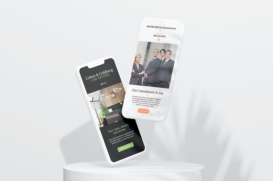
- Mobile-first, responsive design that works on any device
- Practice-area pages that clearly explain your services and expertise
- Prominent calls-to-action: click-to-call, contact forms, consultation scheduling
- Secure hosting and ADA compliance to protect your clients and your firm
- Modern visuals, attorney bios, case results, and testimonials that build trust
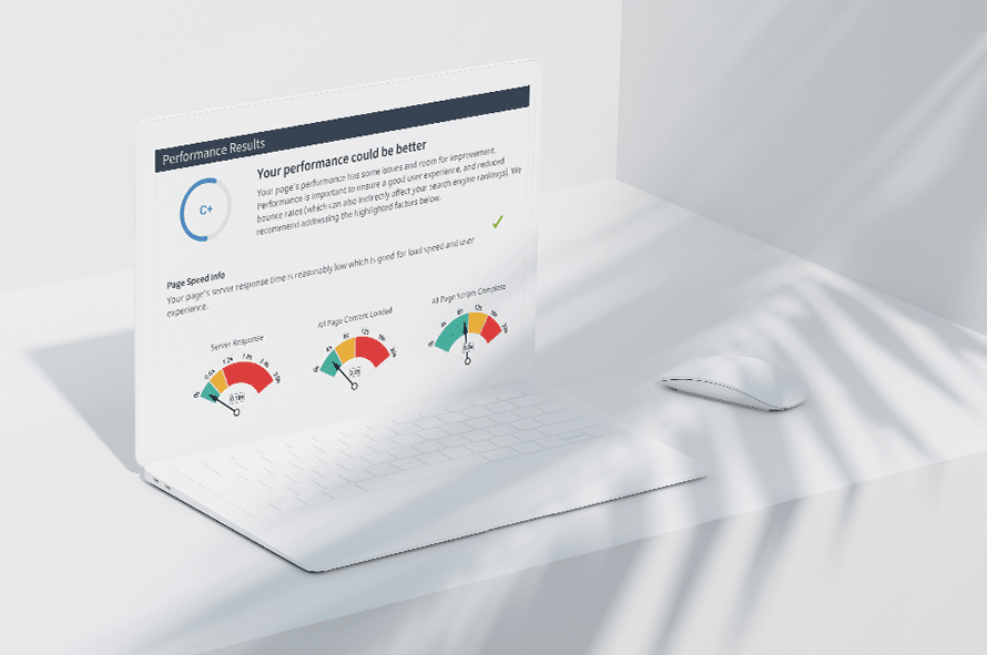
Not sure how your website stacks up? We can help! Enter your website URL for a free analysis.
Test if your legal website is mobile responsive:
MyAdvice has 20+ years of experience building websites for law firms like yours. All of our websites combine form and function, plus the support and knowledge you need. Call us at 435-575-7470 to get started.
Legal Website Resources
Learn more about legal websites.
Effort Meter
Local Search for Lawyers
FUN FACT
of consumers who perform a local search ultimately visit a store within 5 miles of their current location.
Clients rarely scroll past the first few listings when searching for an attorney. If your firm doesn’t appear in local searches and map listings, competitors are capturing those cases.
The Success Center manages your local presence across Google Business Profile and 60+ directories — making sure clients always see accurate, professional information when they search.
What’s Included:
- Verified, accurate directory listings across all major platforms
- Optimized Google Business Profile with updated services, photos, and hours
- Local keyword targeting to capture “family lawyer near me” or “personal injury attorney [City]” searches
- Map pack performance tracking built into your Success Center dashboard
WHY IT MATTERS
of consumers trust online reviews as much as personal recommendations.
Hiring a lawyer is one of the most trust-heavy decisions a person will ever make. Potential clients read reviews to see not just whether you win cases, but how you treat your clients along the way.
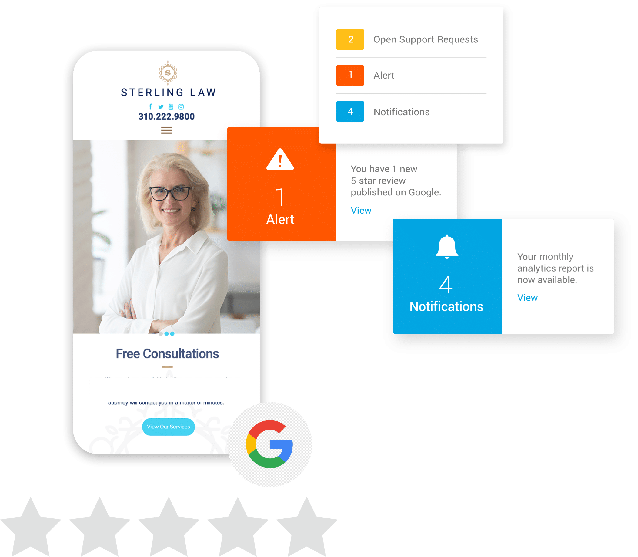
The Success Center automates review requests, manages responses, and consolidates your reputation into one dashboard, helping you build confidence at scale.
What's Included:
- Automated review requests by email and text
- AI-generated, customizable responses — always professional, always compliant
- Real-time alerts for new reviews and sentiment trends
- Dashboard tracking volume, ratings, and patterns in client feedback

WHY IT MATTERS
of all legal firms maintain a presence on at least one social media platform.
Even in law, social media plays a role in credibility. Clients want to see your firm’s personality, values, and authority outside of your website. But managing it consistently takes time you don’t have.
The Success Center automates your social media presence with law-specific templates, AI-generated captions, and a calendar view to keep your profiles active and professional.
What Works Best for Law Firms:
- Attorney introductions and firm milestones
- Case outcomes and testimonials (with consent)
- Thought leadership content on trending legal topics
- Community involvement and firm culture highlights
Effort Meter
Advanced Search Optimization (SO) for Lawyers
WHY IT MATTERS
of searchers never click past the first page of results.
Whether someone searches “estate lawyer near me” or “best personal injury attorney in [City],” your visibility in search results directly impacts your caseload. SEO isn’t just about rankings — it’s about showing up with relevance, authority, and trust.
The Success Center integrates technical SEO, local enhancements, and smart content so your firm doesn’t just get found — it gets chosen.
What's Included:
- Keyword targeting for practice areas and case types
- Optimized attorney bios, service pages, and FAQs
- Blogs that answer the exact questions prospective clients are Googling
- Local SEO enhancements to improve map and organic rankings
- Technical improvements for speed, security, and accessibility
Advanced Search Optimization Resources
Quick tips and tricks on advanced SEO tactics.
Effort Meter
Legal Search Engine Marketing (SEM)
WHY IT MATTERS
of people say paid search ads make it easier to find the information they are seeking on a website or a search engine.
When someone needs an attorney, they need one now. Paid ads ensure your firm is visible at the exact moment a client is searching for representation.
With the Success Center, PPC isn’t just about buying clicks — it’s about driving consultations and measurable ROI.
What's Included:
- Campaigns tailored to legal practice areas and local markets
- High-intent keyword targeting (“divorce lawyer near me,” “accident attorney [City]”)
- Conversion-focused landing pages tied directly to your Success Center tools
- Real-time ROI tracking so you know which ads drive new clients
Shine online.
If you seek answers and help with the items listed above, you’re in the right place. We can help your law firm reach the next level of digital marketing. Schedule your demo now!


Effort Meter
Social Media Marketing for Lawyers